Don’t judge a book by its cover.
It’s a phrase we heard ad nauseum growing up, even before we learned how to read the blocks we’d arranged in our playpen, let alone an entire book. Eventually, of course, it became clear that the phrase had other, more universal connotations. It was meant to suggest that looks can be deceiving; that we shouldn’t prejudge something – people included – based on its, or their, external appearance, for it may not adequately represent what’s inside.
But I was always a very literal child, so all it made me think about was how awful book covers must have been. So awful that it frightened an entire generation of adults into warning children about their hideousness with this one particular sentence.
Its constant doling out made me wonder: If I’d never been given this grave instruction, would I in fact go on to judge books by their metaphorical covers? Or did the utterance of this phrase put that possibility in my head? In all of our heads? Regardless, it’s a warning that our spongy brains have long since soaked up and is now and forever impossible to forget.
We shouldn’t judge a book by its cover. Fine. But we can judge its cover.
The cinematic equivalent to a book cover is the opening title sequence. It’s our entry point, our gateway. If we were to meet a film at a cocktail party, its title sequence would be the one to introduce us. There are a number of ways in which this introduction can be handled. Meekly, awkwardly, with a whole heap of pizzazz. Just as we don’t base relationships with people on the way we were introduced to them, we don’t judge a film by its opening credit sequence. Or do we?
Expectations are a powerful force, and just as trailers commit a number of sins in this regard, opening credit sequences sometimes make promises the film can’t keep.
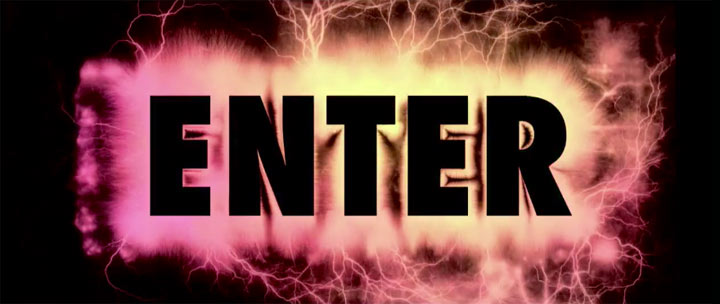
The single most exhilarating credit sequence I can think of is the one that pilots Gaspar Noé’s 2009 swollen head-trip Enter the Void. Starting with the end titles (typical of Noé’s films) in an unsettling strobe effect (another Noé trope), the soundtrack thumps and drones along with the rapid-fire credits before giving way to the main attraction: an orgasmic visual feast of names in hallucinogenic glory set to LFO’s jolty “Freak”.
Though its credits suggest otherwise, Enter the Void is actually more meditative than abrasively flashy, a notion even petulant provocateur Noé seems dubious about embracing. These credits work better as an isolated sequence, compulsively watchable and possessing its own energy the film can’t match. A quieter, less rousing sequence might grant heftier force to the film’s gut-punch moments, of which there are many. Catapult this captivating credit sequence to the end, or axe it completely, leave the single “ENTER” crawl before unveiling the first image, and the experience then begins like the rollercoaster it undoubtedly is: with a slow uphill trek before plunging deep into that titular void as we follow, through first-person perspective, the soul of a man hovering between life and death. Then give us those revelatory credits. Anyone who makes it to the end of this, at times excruciating, endurance test has earned it.
This kind of lavish prefacing is common among unabashed stylists such as Noé. Ex-music video director David Fincher often succeeds in crafting original, innovative title sequences. He seems to take advantage of the opening title montage as a means of revisiting his roots, by cobbling together a singular experience such as the one that ultimately bottlenecks his American remake of The Girl with the Dragon Tattoo.
This sequence alone was one of 2011’s best films. Riveting and visionary, few cinematic moments last year compared to the intrigue of such nightmarish visions while Karen O and Trent Reznor’s cover of Led Zepplin’s “Immigrant Song” mounted on the soundtrack. The film that follows fatally lacks any intrigue, let alone that of its title sequence. Like Enter the Void, Fincher greets us with too invigorating a hello. He raises the pulse and then flatlines.
A title sometimes has no place in the opening credits. As much as I think Moonrise Kingdom is the dullest, drabbest entry in Wes Anderson’s repertoire, its definition of the title in its curtain reveal strikes a uniquely emotional chord.
The title of Kenneth Lonergan’s directorial debut You Can Count On Me is uttered not once in the film, though it’s thoroughly teased in one of its final scenes. Perpetually horn-locked siblings Mark Ruffalo and Laura Linney are tearfully resolving their issues when Ruffalo says, “Remember when we were kids, remember what we always used to say to each other?” Linney replies, “Of course I do.” They embrace, the scene ends, and the words on the poster, ticket stub or DVD box all but holler at us. It’s a master class in subtlety.
As far as subtle title sequences go, the one in Punch-Drunk Love is downright subliminal. About 10 minutes into Paul Thomas Anderson’s sweepingly original dark comic-romance, Jon Brion’s evocative score swells and the screen suddenly bleeds and pulsates with strips of color. Amorphous blobs dissolve in and out, briefly suggesting letters, but never take shape long enough to form any semblance of language. After a short period, the film resumes and leaves us wrongfully assuming that’s where the title had revealed itself. It is every bit a title sequence. It just happens to include everything but the title.
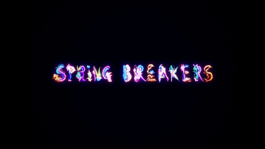
I wrestled with my reaction to Harmony Korine’s Spring Breakers as a whole, which veered from “This is soooo stupid” to “This is soooo genius” in the span of a shot change. It wasn’t until the jingly intro of Ellie Goulding’s “Lights” rang out in my head that I was reminded of the film’s stunning titles over which the song plays. The luminescent dolphins, butterflies and rippling waves that make up each character match the film’s hallucinatory, vivacious beauty. My subsequent review? Spring Breakers lives up to its title font.
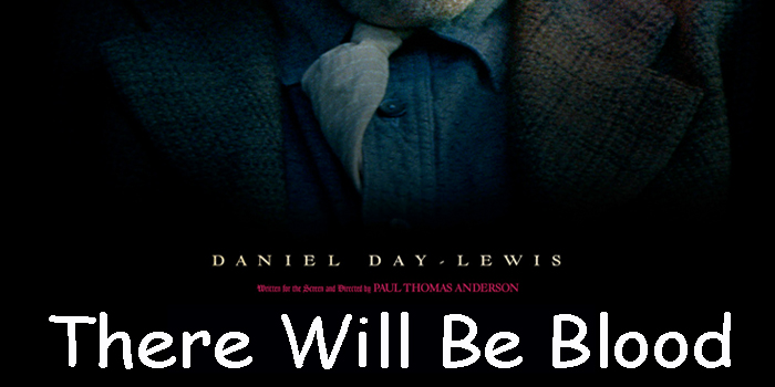
I cannot say the same, however, for the film that long ago spawned this font theory. When I finally saw Paul Thomas Anderson’s There Will Be Blood, I was well aware of the bilious oil tycoon at its center. Daniel Day-Lewis imbues Daniel Plainview with such raging machismo and desperation that it’d be a true feat if the film could keep up with his uniformly electric and domineering presence. Its title font (which is actually called, no joke, Kraut-Type-A-Fuck) heralds that level of brawn, which the film itself can’t sustain. There’s a good 30-40 minutes that can easily be excised from the middle section without regret. Amid that excess is where the film’s burly charge loses its spark, and ultimately can’t live up to its exceptional font choice at the outset. Such a striking set of characters bound to permeate every image that follows, as if each were displayed on a poster in the lobby of a theatre. To faithfully represent There Will Be Blood, a better font for the title would have been Comic Sans.
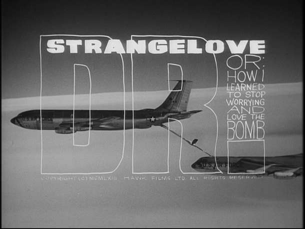
Consider Stanley Kubrick’s Dr. Strangelove or: How I Learned to Stop Worrying and Love the Bomb. The handwritten, childlike scrawl of the titles over footage of airborne warplanes is the perfect encapsulation of the film’s juveniles-in-charge universe. Its credit sequence is alternately terrifying and hilarious.
Above all, credits are meant to be informative. They tell the audience who did what, and who played whom. Too often a title sequence is just padding, or it unreliably touts a film or director before either has proven worthy of such branding. The “A Film by so-and-so” / “A so-and-so Film” credits emanate a whiff of pomposity that, depending on the film, could soon turn into a cloud. Whenever a barely established director boasts the “a film by” credit, it strikes me as he or she desperately posing as director rather than fulfilling the job description. It’s the kind of spotlight-hungry practice demonstrated eternally by the mediocre likes of Tyler Perry or Todd Phillips, who flood their film’s posters and credits with their names, turning each project into less of a self-contained story than a whistle-stop on the Planet Me tour.
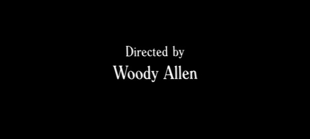
If a title sequence does in fact prove so detrimental to the film it introduces, it would pay to minimize as much as possible. Woody Allen has stuck with the same typographical method since the 1970s. His white type on black screen routine became a fixture in his filmography after deciding it wasn’t worth it financially to continue creating elaborate title sequences. Furthermore, the legendarily prolific filmmaker just isn’t concerned with such trivialities. The titles in his first few features, all rambunctious comedies, were rampantly cartoonish and colorful. But in 1977, he stripped his opening title process way down for Annie Hall, displaying the infamous Windsor font over a black background to a silent soundtrack. It’s one of the most effective intros ever to a film. It creates no expectations, sets no tone. Its credits roll out, we read them, awaiting the film’s initiatory image. It prolongs the anticipation we feel as the lights go down in a theatre before a film begins. Annie Hall’s spare, unassuming, unobtrusive title sequence does what every other title sequence should do. It lets the film speak for itself.







2 thoughts on “Titular Characters: How the Wrong Font Can Destroy a Film”
Pingback: Month in Review: May | French Toast Sunday
comic sans…