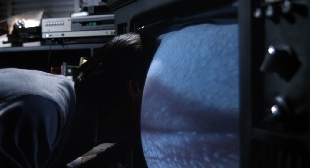
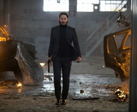
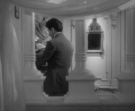
Film is art. The way a scene is framed can evoke the strongest of emotions. Seeing the face of an excitedly terrified young man as he stares at his older lover through the way her leg seductively bends or having a solitary man walk across a bridge, futuristic neon lights cycling counterclockwise in the background stick with us like a painting.
It’s because film is an art form that one of the most appreciated facets of films is the poster art that should manage to perfectly sum up the feel of the movie without saying a word. Poster art has evolved over the years, with different artists offering their own renditions of their thoughts on a film, but the secondary art form never ceases to challenge the perception of the audience. With that in mind, and to celebrate the release of David Cronenberg’s latest film, Maps to the Stars, here are ten posters that beautifully sum up his work.

A movie that examines the life of a reluctant mobster instead of glorifying it, this poster manages to perfect capture the bleakness associated with the underground trade, choosing to highlight the actions and mistakes inked into the skin of a member rather than the man himself. Quiet, but effectively powerful in packing the same wallop Cronenberg does in the film.
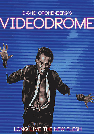
This poster isn’t the best from an artistic sense, but what I love about it is that he’s not staring into the television, but he’s become part of it. It evokes a sense of wonder about the entire situation, but manages to keep it entirely creepy at the same time. The message is clear –the lines between fiction and reality are blurring- and it manages to catch the eye immediately.
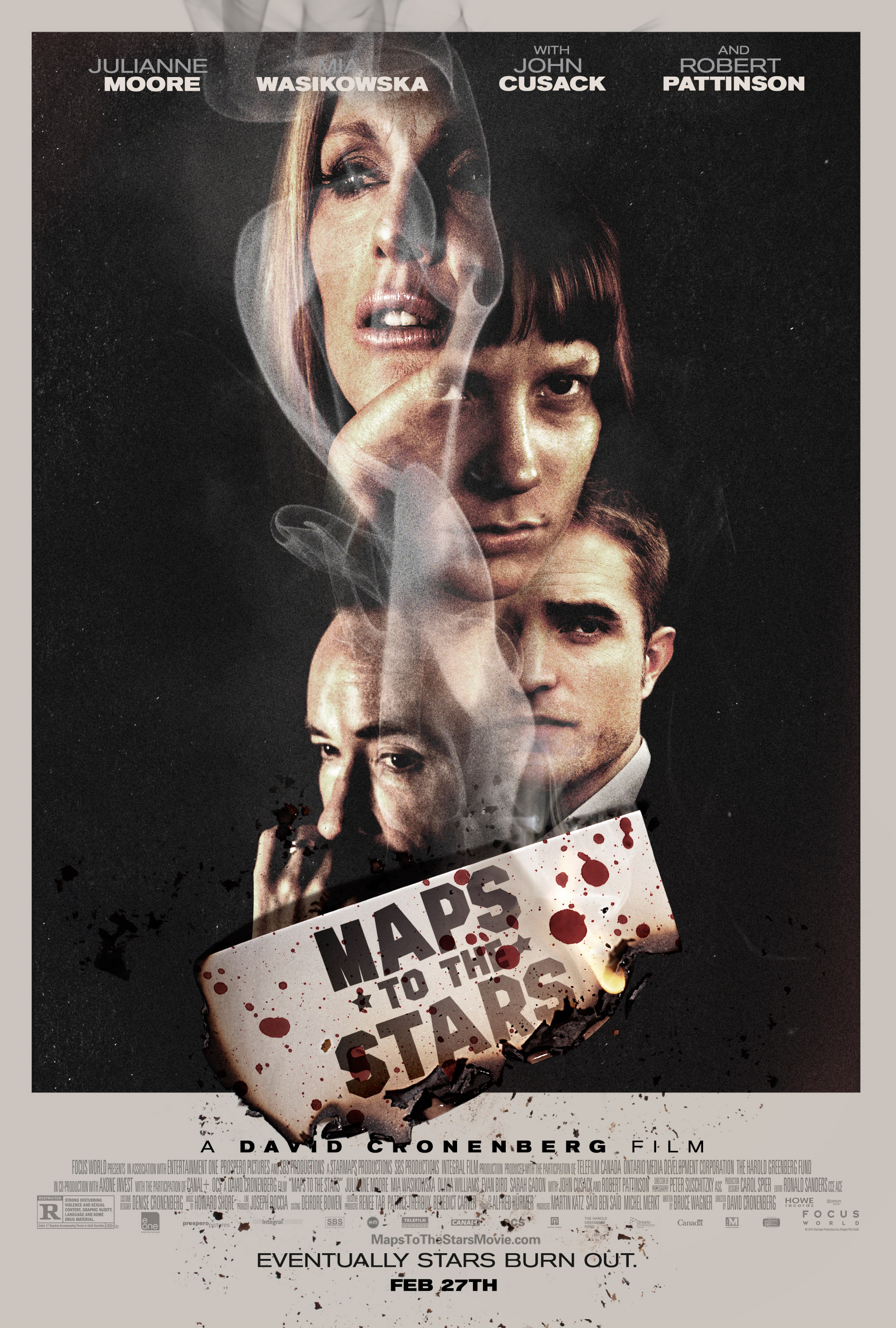
There’s an element of cheekiness to this poster. The smoke rising up, creating a sensual mask for the various celebrities of Hollywood land, the classic black and white colour scheme against an elegant type, and the subtle transparent tone to each of their faces. It’s a facetious take on new Hollywood, a theme that coincides with the actual film.
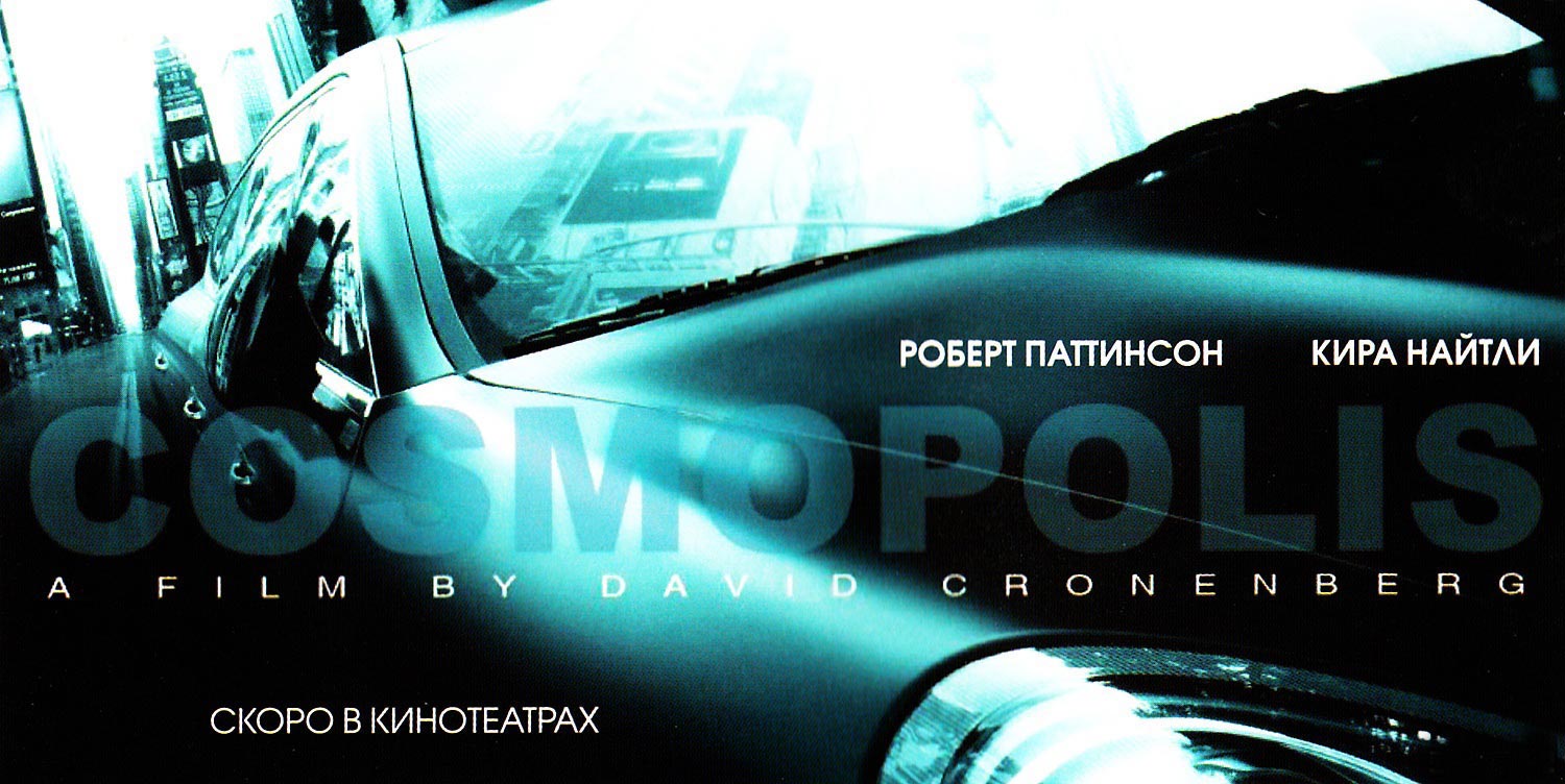
Cosmopolis is one of Cronenberg’s most underrated movies and what’s so effective about this specific poster is the lack of Robert Pattinson. The whole movie focuses on Pattinson’s character. We follow him, we hear his thoughts, we see what he sees. By removing him from the poster, it makes the movie seem monochromatic and empty, much like the character we come to follow. It’s quite genius.

Crash is a disturbing movie and this is an extremely disturbing poster. It reeks of raw sexual energy, even with the obvious leg braces. The pantyhose have become a fetish in the poster, as does the suggestive stance, much like the fetish couples find themselves exploring in the movie. It’s more than a tad uncomfortable, but than so is the movie. It manages to hit its mark without saying a word.
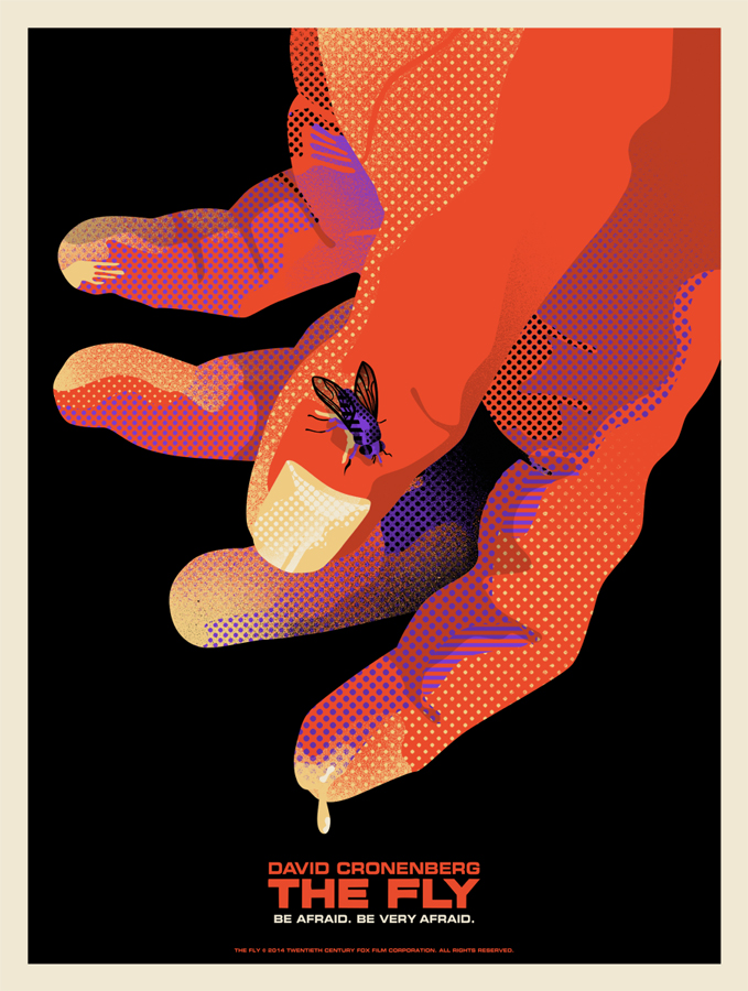
When artists are drawing up a poster for The Fly, their first instinct is usually to enlarge the insect into unrealistic, gigantic proportions. It’s easy to understand why, of course, but it seems redundant and takes away from the actual horror of the movie. In this poster, the fly is fly sized and creates an aura of curiosity for people who haven’t seen it. Why is the fly so important if it looks so normal? What does it do to the man it’s sitting on? Minimalism is usually a safe choice for horror posters and this one in particular nails it.
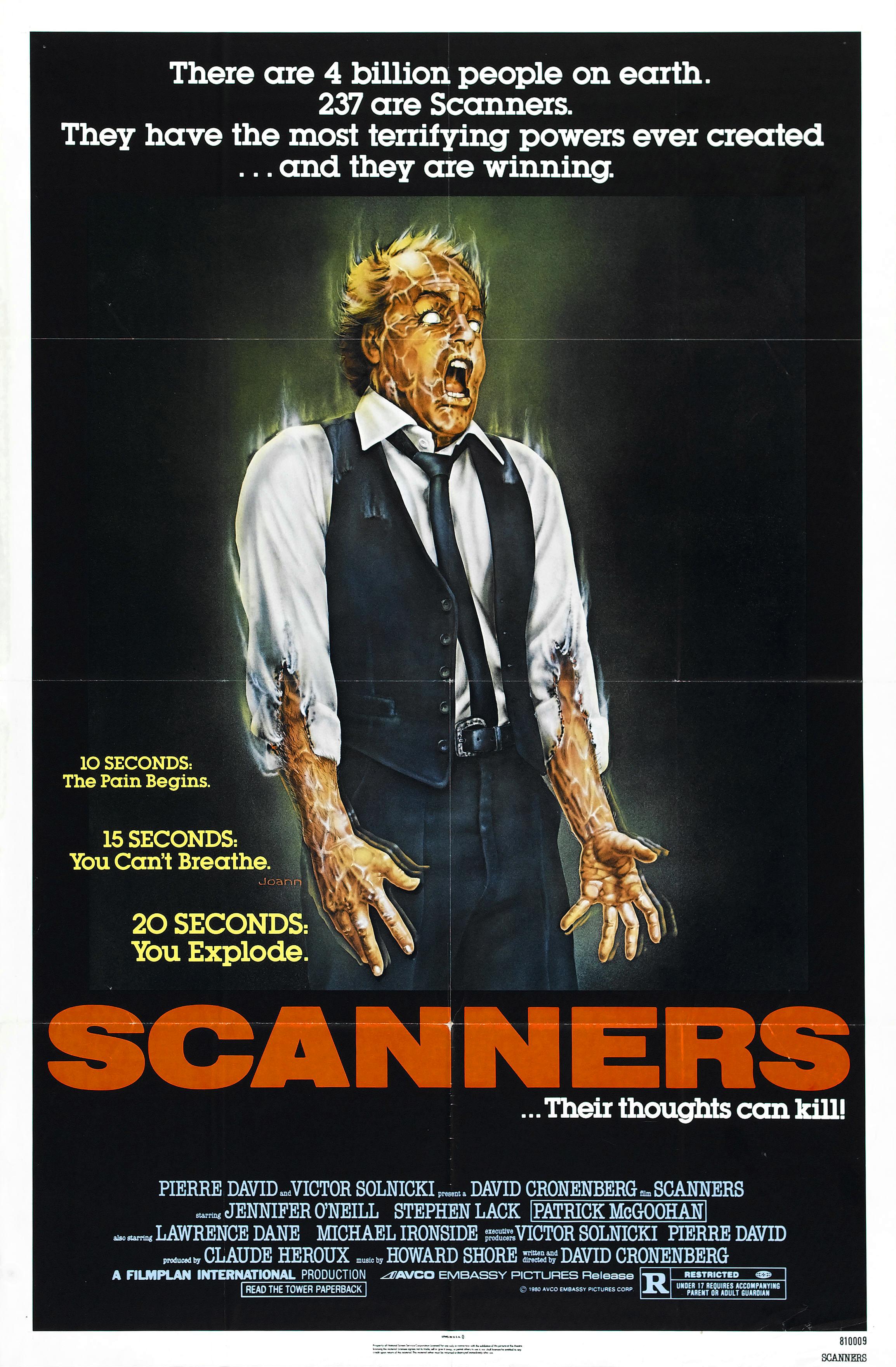
This Scanners poster is classically scary. There’s just enough detail etched into the various body parts that when mashed together with the screaming, petrified look on the man’s face, send shivers down your spine. Although lengthier than most of Cronenberg’s posters, the words presented on the poster were carefully selected. The specific choice manages to get across the promise of terror that awaits moviegoers.
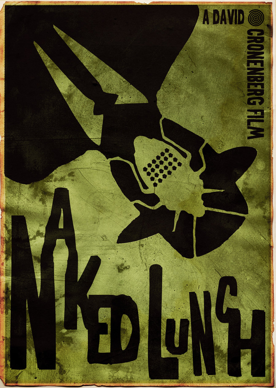
Another minimalist poster, this one manages to hit every main detail of the movie without ruining the surprise of it. The shadow outline of the infamous faceless man from the original poster is still present, but the insect has now moved from covering his face to being inside his head. It’s no longer grotesque, it’s psychological. It’s an interesting statement on a movie that questions the psyche of its characters and it works extremely well as a print.
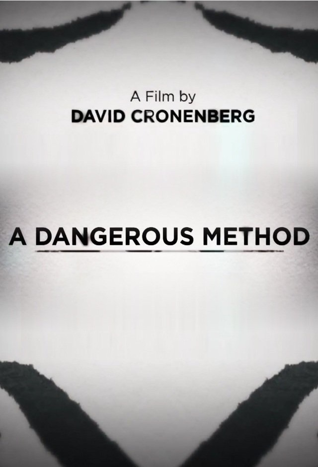
Cronenberg doesn’t stray away from uncomfortable and he doesn’t stray away from sexual. Instead, he combines the two and makes great cinema out of it. This poster doesn’t inform, but asks the looker to perceive. What does it look like? It could be two ink blots representing the psychiatry involved or it could represent genitalia, representing the subject matter of the film. It doesn’t inform, but simply leaves it to question like any piece of art should.
